Bond markets are sending powerful signals right now—and if you’re not paying attention, you could be missing critical clues about where the economy is headed next.
Many investors struggle to make sense of shifting rates, flattening curves, and sudden yield spikes. What do these movements actually mean for inflation, recession risk, capital flows, and long-term wealth strategy? This article is designed to answer those questions clearly and directly, with a practical focus on interpreting bond yields and yield curves in today’s macroeconomic environment.
Drawing on established economic frameworks, on-chain capital flow models, and historical rate-cycle analysis, we break down what bond markets are signaling right now—and how those signals translate into actionable portfolio decisions. You’ll gain clarity on how yields reflect growth expectations, liquidity conditions, and monetary policy shifts, so you can position capital with greater confidence in an increasingly complex financial landscape.
Decoding the Language of the Bond Market
The bond market speaks in percentages, but those numbers carry signals. A bond yield is the annual return investors earn for lending money; the yield curve plots those yields across maturities, from 3‑month bills to 30‑year bonds. Shape matters: a normal curve slopes upward, reflecting higher compensation for time and inflation risk (think of it as patience pay). An inverted curve flips downward, often preceding recessions (Federal Reserve data shows inversions before most U.S. downturns since 1955). By interpreting bond yields and yield curves, investors gauge capital flows, credit conditions, and portfolio positioning.
The Foundational Concepts: Yields and Curves Explained
Before diving into market forecasts or recession signals, we need to start with the basics.
What Is a Bond Yield?
A bond yield is the return an investor realizes on a bond. In simple terms, it’s how much you earn for lending money to a government or company. However, yield is not the same as the coupon rate—the fixed interest payment printed on the bond.
The coupon rate tells you what the bond pays. The yield to maturity (YTM) tells you what you’ll actually earn if you hold the bond until it matures, factoring in the price you paid. For example, if you buy a $1,000 bond with a 5% coupon for $900, your real return is higher than 5% (a small but powerful distinction).
Naturally, yields don’t move randomly. They respond to three main forces:
- Central bank interest rates (like the Federal Reserve’s policy rate)
- Inflation expectations (higher inflation usually pushes yields up)
- Credit risk (riskier issuers must offer higher yields)
Some argue yields are too technical to matter for everyday investors. But ignoring them is like driving without checking the fuel gauge.
What Is a Yield Curve?
Now, step back.
A yield curve is a graph that plots yields of bonds with equal credit quality but different maturities.
- The Y-axis shows yield.
- The X-axis shows time to maturity (3-month, 2-year, 10-year, 30-year).
This visual snapshot helps with interpreting bond yields and yield curves to understand market expectations about growth and inflation.
So what’s next? Once you grasp the shape of the curve—upward, flat, or inverted—you can begin connecting it to economic cycles and portfolio strategy decisions.
Interpreting the Three Primary Yield Curve Shapes

If you’ve ever looked at a yield curve chart and thought, “Why does this look like a random squiggle?” you’re not alone. One of the biggest frustrations investors share is feeling like they’re missing some secret code. The truth? The shape tells a story—once you know how to read it.
The Normal Yield Curve (Upward Sloping)
A normal yield curve slopes upward, meaning long-term bonds have higher yields than short-term bonds. That extra yield is called a term premium—the added compensation investors demand for locking up money longer.
This is the most common shape. It signals expectations of healthy economic growth and stable inflation. Investors assume the economy will expand, so they want higher returns for longer commitments. Think of it as the economy cruising steadily on the highway (not speeding, not stalling).
The Flat Yield Curve
A flat yield curve appears when short-term and long-term yields are nearly the same. Investors aren’t demanding much additional compensation for time. That’s usually a red flag for uncertainty.
This shape often shows up during transitions—when markets are unsure whether growth will accelerate or slow. It’s the financial equivalent of everyone holding their breath.
The Inverted Yield Curve (Downward Sloping)
An inverted yield curve slopes downward, with short-term bonds yielding more than long-term bonds. Historically, this has been one of the most reliable predictors of recession (the U.S. curve inverted before every recession since 1955, according to the Federal Reserve).
Why? Investors expect future interest rates to fall as economic activity weakens. So they rush into long-term bonds, pushing those yields down.
When it comes to interpreting bond yields and yield curves, focus on these patterns:
- Upward = growth expectations
- Flat = uncertainty
- Inverted = recession risk
Understanding these shapes is essential when creating a personal investment strategy from scratch—because guessing wrong about the economic cycle is a mistake few portfolios forgive.
The Practical Implications for Investors and the Economy
The Yield Curve as an Economic Forecasting Tool
First and foremost, the yield curve is more than a line on a chart—it’s a forward-looking signal. When economists track the spread between the 10-year and 2-year Treasury yields, they’re watching for shifts in growth expectations. A “yield spread” simply means the difference between long-term and short-term interest rates. Historically, an inverted yield curve—when short-term rates rise above long-term rates—has preceded U.S. recessions (Federal Reserve Bank of New York).
Some critics argue the signal is outdated due to central bank intervention. However, even in modern markets, the curve has remained a remarkably consistent warning sign. For investors, the benefit is clear: early awareness allows you to adjust allocations before headlines confirm the slowdown.
Impact on Bank Profitability and Lending
Meanwhile, banks typically borrow short-term and lend long-term. A flat or inverted curve compresses that margin, reducing profitability. In turn, banks may tighten credit standards, slowing business expansion and consumer spending (Federal Reserve data). While some claim diversified revenue shields large banks, lending margins still matter. For investors, recognizing this dynamic can help anticipate shifts in financial sector performance.
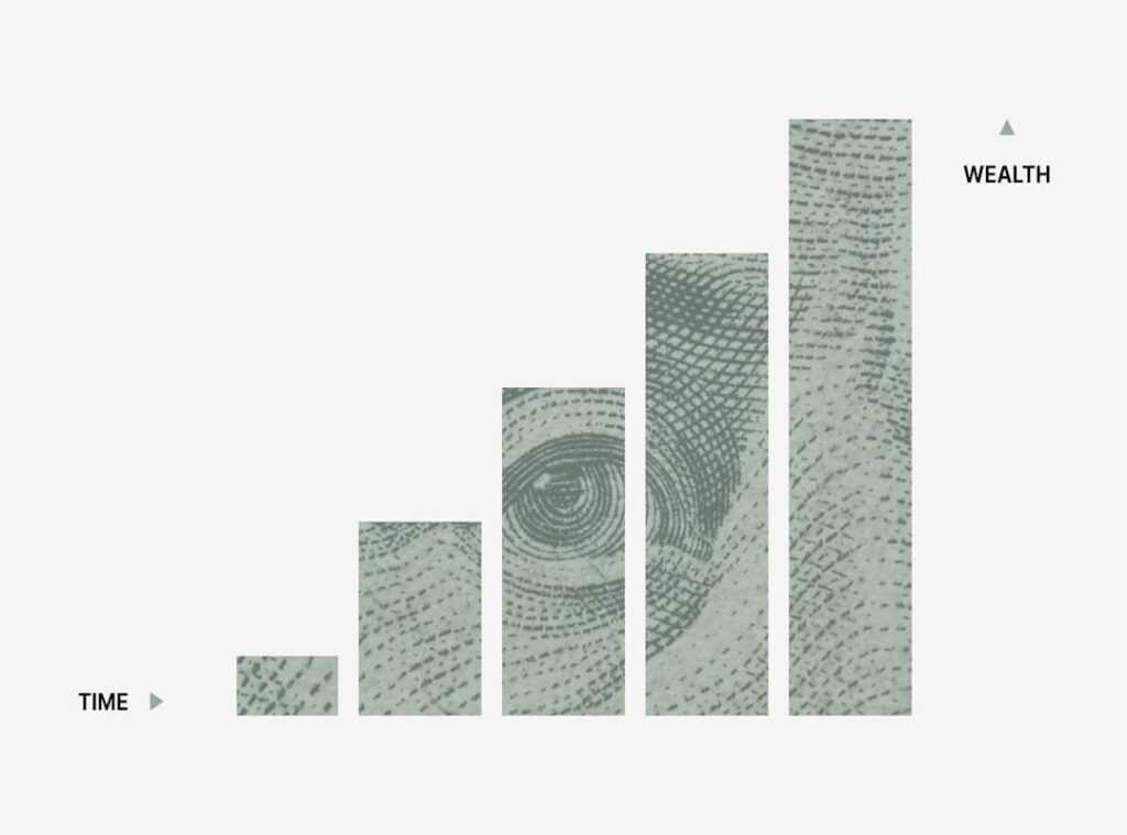
Informing Capital Flow and Wealth Planning
Ultimately, interpreting bond yields and yield curves empowers smarter portfolio positioning. A steep, normal curve often signals expansion, favoring growth stocks. Conversely, an inverted curve may push capital toward long-term government bonds as defensive assets. Think of it as adjusting your sails before the storm hits (yes, boring bonds can be heroes sometimes).
In short, understanding the curve isn’t academic—it’s a practical edge for protecting and growing wealth.
“You’ve seen the chart,” a colleague told me, tapping the screen. “But do you see the message?”
The yield curve isn’t just lines on a graph; it’s collective expectation in motion. Markets whisper before they shout. When short-term yields rise above long-term ones, investors are signaling caution about growth ahead (yes, that bend matters).
Some argue it’s unreliable. “It’s different this time,” they insist. Yet history suggests otherwise; inversions have preceded U.S. recessions (Federal Reserve data).
The real advantage of interpreting bond yields and yield curves isn’t market timing. It’s context. Use that context to stress-test allocations and build resilience.
Position Yourself for What’s Next
You came here to make sense of shifting economic signals and understand how rates, capital flows, and macro data impact your financial decisions. Now you have a clearer framework for interpreting bond yields and yield curves and using them to anticipate market moves instead of reacting to them.
The real risk isn’t volatility — it’s misreading the signals and allocating capital based on outdated assumptions. When you understand how yields reflect inflation expectations, growth forecasts, and liquidity conditions, you stop guessing and start positioning strategically.
But insight only works if you act on it.
If you’re serious about protecting and growing your wealth in uncertain markets, start applying these yield and macro frameworks to your portfolio today. Access deeper breakdowns, real-time economic insights, and proven capital flow strategies trusted by thousands of disciplined investors.
Don’t let confusing rate movements dictate your outcomes. Take control, refine your strategy, and put macro intelligence to work now.
 Chief Economic Strategist
Ask Michael Torresidosan how they got into capital flow strategies and you'll probably get a longer answer than you expected. The short version: Michael started doing it, got genuinely hooked, and at some point realized they had accumulated enough hard-won knowledge that it would be a waste not to share it. So they started writing.
What makes Michael worth reading is that they skips the obvious stuff. Nobody needs another surface-level take on Capital Flow Strategies, Wealth Planning Techniques, Expert Tutorials. What readers actually want is the nuance — the part that only becomes clear after you've made a few mistakes and figured out why. That's the territory Michael operates in. The writing is direct, occasionally blunt, and always built around what's actually true rather than what sounds good in an article. They has little patience for filler, which means they's pieces tend to be denser with real information than the average post on the same subject.
Michael doesn't write to impress anyone. They writes because they has things to say that they genuinely thinks people should hear. That motivation — basic as it sounds — produces something noticeably different from content written for clicks or word count. Readers pick up on it. The comments on Michael's work tend to reflect that.
Chief Economic Strategist
Ask Michael Torresidosan how they got into capital flow strategies and you'll probably get a longer answer than you expected. The short version: Michael started doing it, got genuinely hooked, and at some point realized they had accumulated enough hard-won knowledge that it would be a waste not to share it. So they started writing.
What makes Michael worth reading is that they skips the obvious stuff. Nobody needs another surface-level take on Capital Flow Strategies, Wealth Planning Techniques, Expert Tutorials. What readers actually want is the nuance — the part that only becomes clear after you've made a few mistakes and figured out why. That's the territory Michael operates in. The writing is direct, occasionally blunt, and always built around what's actually true rather than what sounds good in an article. They has little patience for filler, which means they's pieces tend to be denser with real information than the average post on the same subject.
Michael doesn't write to impress anyone. They writes because they has things to say that they genuinely thinks people should hear. That motivation — basic as it sounds — produces something noticeably different from content written for clicks or word count. Readers pick up on it. The comments on Michael's work tend to reflect that.