If you’re searching for clarity in today’s volatile markets, you’re likely overwhelmed by fragmented headlines, conflicting forecasts, and fast-moving capital shifts. This article is designed to cut through that noise by showing you how to use global financial data dashboards to track real-time capital flows, macroeconomic signals, and structural market trends that actually matter.
Rather than relying on opinion-driven commentary, we focus on data-backed indicators—liquidity cycles, interest rate movements, inflation metrics, and on-chain activity—to help you interpret where money is moving and why. By combining economic fundamentals with practical analytical frameworks, this guide helps you turn raw data into actionable insight.
Our analysis draws on established macroeconomic models, historical cycle comparisons, and transparent data methodologies to ensure accuracy and reliability. By the end, you’ll understand how to read key indicators, identify emerging shifts early, and apply structured decision-making to strengthen your financial positioning in a rapidly evolving global economy.
Seeing the Global Economy Clearly: The Power of Data Visualization
Today’s investors face a paradox: more data, less clarity. Gross Domestic Product (GDP, the total value of goods and services produced) and capital flows (money moving across borders) flood your screen daily. Yet raw figures rarely reveal direction.
That’s where global financial data dashboards come in. Instead of spreadsheets, you see patterns—like inflation spikes spreading across regions (think weather radar, but for money).
So, what should you do? First, choose tools with interactive maps and time filters. Next, compare regions side‑by‑side. Pro tip: always cross‑check visual trends with source data to avoid misleading scales.
The Analyst’s Toolkit: Essential Features for International Economic Analysis
If you’re serious about cross-border investing, your tools matter just as much as your thesis. In my view, too many analysts rely on surface-level apps that show headlines but lack depth (that’s like judging a movie by its trailer).
Real-Time & Historical Data Access
First, real-time data—information delivered instantly as markets move—is essential. But equally important is historical data, meaning archived figures stretching back years or decades. Institutions like the IMF and World Bank provide this depth, allowing you to track patterns such as Argentina’s recurring debt cycles or Japan’s long-term yield suppression (World Bank Data; IMF Data Portal). Without that context, trend analysis is guesswork.
Customization and Visualization
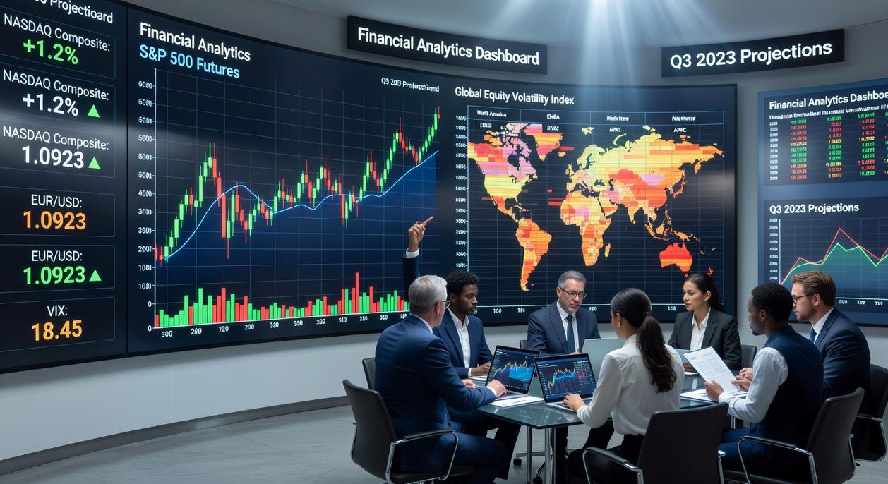
That said, raw data isn’t enough. I strongly prefer platforms that let me build customizable dashboards. Seeing currency exchange rates, sovereign bond yields, and commodity prices side-by-side changes how you interpret capital flows. The best global financial data dashboards also include advanced charting—heatmaps (color-coded performance grids), scatter plots for correlation, and candlestick charts that reveal market sentiment.
Geospatial mapping, in my opinion, is non-negotiable. When capital flows shift from emerging Asia to North America, a world map makes it instantly obvious. Finally, export and integration options matter. If I can’t plug data into Excel or Python for deeper modeling, I’m already looking for another tool.
Choosing Your Lens: A Breakdown of Leading Visualization Platforms
The right visualization platform doesn’t just show you data—it shapes how you interpret risk, opportunity, and timing. Think of it as choosing between a microscope, a drone, or a custom-built lab. Each lens offers different benefits depending on your goals.
For the Professional Analyst (Institutional Grade)
Bloomberg Terminal and Refinitiv Eikon are the gold standard for investment banks and hedge funds. They deliver:
- Real-time market data across asset classes
- Proprietary analytics and risk models
- Deep news integration and macro dashboards
The benefit? Speed and confidence. When millions are on the line, milliseconds matter (Wall Street doesn’t wait). These platforms function like command centers—true global financial data dashboards with institutional-grade depth.
Critics argue the cost—often $20,000+ per user annually (Bloomberg)—is prohibitive. They’re right. But for firms managing large portfolios, the return on faster execution and richer analytics often outweighs the price.
For the Prosumer & Active Investor (Web-Based)
Platforms like TradingView and Koyfin offer powerful charting, economic indicators, and collaborative tools at accessible price points.
Benefits include:
- Custom technical indicators
- Broad macro data coverage
- Community-driven trade ideas
You gain flexibility without institutional overhead. For investors tracking macro cycles or learning how interest rate changes influence market trends, tools like this—paired with resources on https://ontpeconomy.com.co/how-interest-rate-changes-influence-market-trends/—create practical context.
Some professionals dismiss web tools as “retail grade.” Yet many independent traders outperform institutions precisely because they move faster and think independently (Moneyball, but for markets).
For the Data Scientist & Quant (API-Driven & Open-Source)
Quandl (Nasdaq Data Link) combined with Python libraries like Matplotlib and Plotly offers ultimate flexibility.
The payoff?
- Build bespoke on-chain valuation models
- Automate quantitative strategies
- Visualize exactly what you need
Yes, the learning curve is steep. But the benefit is total control—your model, your edge. For quants, that autonomy is priceless.
Practical Application: Visualizing Capital Flows and On-Chain Trends
I used to think watching headlines was enough to understand capital flows. It wasn’t. I missed early signals simply because I wasn’t visualizing the data.
Tracking Foreign Direct Investment (FDI)
FDI refers to cross-border investments where a firm or fund acquires a lasting stake in a foreign economy (think factories, infrastructure, or majority equity positions). Using global financial data dashboards, map inflows and outflows between countries over time. The first mistake I made? Looking at totals instead of trends. A country might post high FDI, but declining quarterly inflows can signal weakening confidence. Trend direction matters more than absolute numbers.
Analyzing Sovereign Debt Markets
A yield curve plots interest rates across different maturities of government bonds. When I first compared countries, I looked at them separately. Big error. Overlay multiple yield curves on one chart. Flattening or inversion (short-term yields above long-term) often signals stress (Federal Reserve Bank of New York). Seeing divergence side-by-side reveals which economies investors trust.
Mapping On-Chain Economic Activity
Tools like Glassnode and Nansen visualize blockchain flows—wallet activity, exchange balances, long-term holder supply. Early on, I ignored on-chain data, assuming it was “crypto-only.” Wrong. Rising exchange inflows often precede volatility. It’s a proxy for risk appetite, much like emerging market fund flows.
Correlating Commodity Prices with Currency Strength
Layer oil prices with the Canadian Dollar. Canada is a major oil exporter (Natural Resources Canada). I once traded CAD without checking oil trends—rookie move. When commodities rise, exporter currencies often strengthen. Correlation doesn’t guarantee causation—but ignoring it? That’s costly.
Building Your Strategic View: From Raw Data to Actionable Insight
The real challenge isn’t a shortage of numbers. It’s knowing what they mean. Data without interpretation is like owning a gym membership without a workout plan (technically useful, practically idle). The right visualization tool becomes your lens—turning scattered figures into a coherent economic story.
However, not every lens fits every investor. Some argue that more data automatically leads to better decisions. In reality, that often creates noise, not clarity. What matters is alignment. Professional terminals offer depth, APIs provide flexibility, and global financial data dashboards deliver breadth. The key is choosing what matches your analytical style.
So before selecting a platform, pause. Ask yourself:
- What 5–10 international economic questions must I answer regularly?
- Which indicators truly influence my portfolio?
- How frequently do I need updates?
In other words, start with the map, not the vehicle. When your questions guide the tool—not the reverse—you build a dashboard that sharpens strategy and strengthens long-term wealth planning.
Take Control of the Trends Shaping Your Financial Future
You came here to better understand the financial trends, capital flows, and on-chain models shaping today’s economy — and now you have the clarity to see how they connect. From macroeconomic shifts to digital asset movements, you’re no longer guessing. You’re reading the signals with intention.
But the real risk isn’t lack of information — it’s falling behind while markets move fast. Capital rotates quickly. Liquidity shifts without warning. Without a structured way to track these patterns, even smart investors miss opportunities.
That’s why your next step matters.
Start using reliable global financial data dashboards to monitor capital flows, macro indicators, and on-chain metrics in real time. Build a repeatable system. Review the data weekly. Align your strategy with what the numbers are actually showing — not headlines or hype.
Investors who rely on structured data consistently outperform those who react emotionally. If you’re serious about protecting and growing your wealth, commit to tracking the metrics that move markets.
Don’t just stay informed — stay ahead. Start analyzing the data today and turn insight into strategic action.
 Chief Economic Strategist
Ask Michael Torresidosan how they got into capital flow strategies and you'll probably get a longer answer than you expected. The short version: Michael started doing it, got genuinely hooked, and at some point realized they had accumulated enough hard-won knowledge that it would be a waste not to share it. So they started writing.
What makes Michael worth reading is that they skips the obvious stuff. Nobody needs another surface-level take on Capital Flow Strategies, Wealth Planning Techniques, Expert Tutorials. What readers actually want is the nuance — the part that only becomes clear after you've made a few mistakes and figured out why. That's the territory Michael operates in. The writing is direct, occasionally blunt, and always built around what's actually true rather than what sounds good in an article. They has little patience for filler, which means they's pieces tend to be denser with real information than the average post on the same subject.
Michael doesn't write to impress anyone. They writes because they has things to say that they genuinely thinks people should hear. That motivation — basic as it sounds — produces something noticeably different from content written for clicks or word count. Readers pick up on it. The comments on Michael's work tend to reflect that.
Chief Economic Strategist
Ask Michael Torresidosan how they got into capital flow strategies and you'll probably get a longer answer than you expected. The short version: Michael started doing it, got genuinely hooked, and at some point realized they had accumulated enough hard-won knowledge that it would be a waste not to share it. So they started writing.
What makes Michael worth reading is that they skips the obvious stuff. Nobody needs another surface-level take on Capital Flow Strategies, Wealth Planning Techniques, Expert Tutorials. What readers actually want is the nuance — the part that only becomes clear after you've made a few mistakes and figured out why. That's the territory Michael operates in. The writing is direct, occasionally blunt, and always built around what's actually true rather than what sounds good in an article. They has little patience for filler, which means they's pieces tend to be denser with real information than the average post on the same subject.
Michael doesn't write to impress anyone. They writes because they has things to say that they genuinely thinks people should hear. That motivation — basic as it sounds — produces something noticeably different from content written for clicks or word count. Readers pick up on it. The comments on Michael's work tend to reflect that.