
Understanding where we are in the market cycle can be the difference between protecting your capital and chasing momentum at the wrong time. If you’re searching for clarity on shifting trends, capital flows, and what they mean for your portfolio, this market cycle analysis guide is built for you.
Investors often struggle to separate short-term noise from structural shifts. Headlines change daily, but underlying liquidity, macroeconomic signals, and on-chain data tell a more consistent story. This article focuses on breaking down those signals in a practical way—so you can identify expansion phases, distribution tops, contraction periods, and early recovery signs with greater confidence.
Our insights are grounded in data-driven economic models, capital flow analysis, and real-time market behavior tracking. By combining macro fundamentals with on-chain metrics and strategic wealth planning principles, we provide a structured framework—not speculation.
By the end, you’ll have a clearer view of the current cycle phase and actionable context to make more informed financial decisions.
Markets move in rhythms, much like seasons shifting from spring growth to winter slowdown. Likewise, economies expand, peak, contract, and recover in recognizable patterns. Investing without understanding these cycles is like sailing without a compass—you feel every storm but never see it coming.
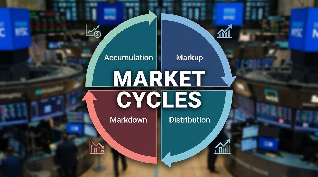
In this market cycle analysis guide, you’ll learn the four phases of the market cycle—accumulation, markup, distribution, and markdown—and the key indicators that signal each stage, from GDP trends to interest rates and sentiment data. By recognizing these signals, you can position assets more strategically (and sleep better at night). That clarity builds lasting financial confidence consistently.
The Four Essential Phases of Every Market Cycle
Every market moves in a pattern. Not randomly. Not magically. But cyclically. A market cycle is the natural rise and fall of economic activity over time, driven by capital flows, credit conditions, and human psychology (yes, fear and greed still run the show).
Phase 1: Expansion/Recovery
Expansion begins after a downturn. Economic activity rises, interest rates are typically low, corporate profits grow, and confidence slowly returns. This is when a bull market—an extended period of rising asset prices—takes shape.
Recommendation: Start accumulating fundamentally strong assets early in this phase. Waiting for “certainty” usually means paying higher prices later.
Phase 2: Peak
Growth slows. Inflation rises. Central banks increase interest rates to cool the economy (Federal Reserve policy data consistently shows tightening cycles near peaks). Optimism turns euphoric. Valuations stretch.
When everyone believes prices can only go up, risk is usually highest.
Smart investors rebalance here. Not because the sky is falling—but because cycles always turn.
Phase 3: Contraction/Recession
Economic output declines. Unemployment rises. Profits shrink. A bear market—sustained price declines—takes hold. Media narratives become relentlessly negative (as they did in 2008 and 2020).
Recommendation: Protect capital. Reduce leverage. Focus on liquidity and quality.
Phase 4: Trough
The trough is the bottom. Sentiment is bleak. Data stabilizes quietly before headlines improve (National Bureau of Economic Research timelines confirm recoveries often begin before optimism returns).
This phase historically offers the strongest long-term opportunities.
• Accumulate selectively when fear dominates
• Follow a disciplined market cycle analysis guide
Cycles are inevitable. Your preparation determines whether you survive them—or benefit from them.
Key Indicators: Your Dashboard for Market Analysis
If you’re serious about understanding markets, you need a dashboard—not headlines. In my experience, most investors react to noise instead of tracking key economic indicators (measurable data points that signal economic direction). That’s like driving by staring in the rearview mirror.
Here’s how I break them down.
-
Leading Economic Indicators
These signal where the economy might go next. Think of them as early-warning systems. Examples include the ISM Manufacturing Index (factory activity levels), building permits (future construction plans), and the yield curve (the spread between short- and long-term Treasury rates). An inverted yield curve has preceded every U.S. recession since 1955 (National Bureau of Economic Research). Some critics argue these indicators create false alarms—and occasionally they do. But I’d rather prepare early than be surprised late. -
Coincident Economic Indicators
These reflect what’s happening right now. GDP (Gross Domestic Product, total economic output) and nonfarm payrolls (total employed workers excluding farm labor) fall into this category. They confirm the current phase of the business cycle—expansion or contraction. -
Lagging Economic Indicators
These confirm trends after they’ve already unfolded. The Consumer Price Index (CPI) measures inflation, while the unemployment rate shows labor market health. By the time unemployment spikes, the slowdown is already underway (U.S. Bureau of Labor Statistics).
Some argue lagging data is useless. I disagree. Confirmation prevents emotional overreactions.
Interestingly, similar principles apply to crypto markets through on-chain models—blockchain-based metrics tracking wallet activity and capital flows. It’s the same market cycle analysis guide, just with digital footprints instead of factory orders.
If you want deeper context on rate dynamics, review how to analyze inflation and interest rate trends effectively.
Track these consistently, and you’ll stop guessing—and start interpreting.
Asset Performance Through the Cycle: A Strategic Overview
Understanding the economic cycle—the recurring pattern of expansion, peak, contraction, and trough in economic activity—can dramatically improve asset allocation decisions. Think of it as a weather forecast for markets (not perfect, but better than guessing).
During Expansion, growth accelerates, employment rises, and consumer confidence improves. As a result, cyclical stocks—companies whose profits rise with economic growth, such as tech and consumer discretionary—often outperform. Commodities may also gain as demand increases. For example, during the 2010–2019 expansion, the S&P 500 Information Technology sector significantly outpaced defensive sectors (S&P Dow Jones Indices).
As the Peak approaches, inflation pressures and tighter monetary policy can emerge. At this stage, investors often rotate toward defensive assets like utilities and healthcare. Value stocks—shares priced lower relative to fundamentals—may begin outperforming growth stocks as earnings expectations moderate.
During Contraction, preserving capital becomes the priority. Government bonds, cash, and defensive stocks (consumer staples, healthcare) are typically favored because of their relative stability. U.S. Treasuries, for instance, historically perform well during recessions (Federal Reserve data).
At the Trough, pessimism is high—but opportunity often is too. This is when accumulating growth stocks at discounted valuations can be strategic. Pro tip: use a market cycle analysis guide to avoid emotional decisions and rebalance methodically.
Practical Tools and Resources for Aspiring Analysts
If you want sharper market instincts, start with tools professionals actually use (no fancy Bloomberg terminal required).
- FRED (Federal Reserve Economic Data) – Free, reliable macro data straight from the source: https://fred.stlouisfed.org. Ideal for tracking inflation, GDP, and labor trends.
- TradingView – User-friendly charting for technical analysis and indicator tracking.
- Yahoo Finance – Quick fundamentals, earnings data, and historical price charts.
Pair these with a solid market cycle analysis guide to interpret trends.
MY PREDICTION: retail access to macro data will drive smarter, faster capital rotation over the next decade (think Moneyball, but for markets).
Understanding the four market phases—accumulation (smart money buying), markup (prices rising), distribution (early sellers exiting), and markdown (broad decline)—gives you a strategic map for navigating uncertainty. However, cycle analysis isn’t about perfectly timing tops and bottoms. Instead, it helps you assess the current environment so you can adjust risk, rebalance exposure, and spot asymmetric opportunities. In practice, start small. Track one or two indicators from this market cycle analysis guide, such as volume trends or yield spreads. Over time, consistent observation builds pattern recognition—and confidence grounded in evidence, not headlines. Stay patient and review your data monthly to refine decisions.
Master the Market Cycle With Confidence
You set out to understand how market cycles really work — and now you have the clarity to see how expansions, peaks, contractions, and recoveries shape every major financial move. More importantly, you can recognize how capital flows shift during each phase and what that means for your strategy.
The biggest mistake investors make is reacting emotionally at the wrong stage of the cycle. Buying into hype. Selling into fear. Missing the transition signals that matter most. When you understand cycle positioning, you stop guessing and start acting with structure.
Now it’s time to put that knowledge to work.
Start applying this market cycle analysis guide to your current portfolio. Identify where we are in the broader cycle, reassess your asset allocation, and adjust your capital flow strategy accordingly. Small, informed adjustments made at the right time can protect wealth and unlock major upside.
If you’re serious about staying ahead of economic shifts instead of reacting to them, deepen your analysis, follow structured cycle data, and commit to disciplined decision-making. Thousands of readers rely on our insights to navigate volatility with clarity and confidence.
Don’t let the next cycle shift catch you off guard. Apply what you’ve learned today — and position yourself where capital is moving next.
 Chief Economic Strategist
Ask Michael Torresidosan how they got into capital flow strategies and you'll probably get a longer answer than you expected. The short version: Michael started doing it, got genuinely hooked, and at some point realized they had accumulated enough hard-won knowledge that it would be a waste not to share it. So they started writing.
What makes Michael worth reading is that they skips the obvious stuff. Nobody needs another surface-level take on Capital Flow Strategies, Wealth Planning Techniques, Expert Tutorials. What readers actually want is the nuance — the part that only becomes clear after you've made a few mistakes and figured out why. That's the territory Michael operates in. The writing is direct, occasionally blunt, and always built around what's actually true rather than what sounds good in an article. They has little patience for filler, which means they's pieces tend to be denser with real information than the average post on the same subject.
Michael doesn't write to impress anyone. They writes because they has things to say that they genuinely thinks people should hear. That motivation — basic as it sounds — produces something noticeably different from content written for clicks or word count. Readers pick up on it. The comments on Michael's work tend to reflect that.
Chief Economic Strategist
Ask Michael Torresidosan how they got into capital flow strategies and you'll probably get a longer answer than you expected. The short version: Michael started doing it, got genuinely hooked, and at some point realized they had accumulated enough hard-won knowledge that it would be a waste not to share it. So they started writing.
What makes Michael worth reading is that they skips the obvious stuff. Nobody needs another surface-level take on Capital Flow Strategies, Wealth Planning Techniques, Expert Tutorials. What readers actually want is the nuance — the part that only becomes clear after you've made a few mistakes and figured out why. That's the territory Michael operates in. The writing is direct, occasionally blunt, and always built around what's actually true rather than what sounds good in an article. They has little patience for filler, which means they's pieces tend to be denser with real information than the average post on the same subject.
Michael doesn't write to impress anyone. They writes because they has things to say that they genuinely thinks people should hear. That motivation — basic as it sounds — produces something noticeably different from content written for clicks or word count. Readers pick up on it. The comments on Michael's work tend to reflect that.